
Core UI — NieR: Automata
Part of the inspirations for the Core UI design proposal.
Overview
NieR: Automata is the primary visual inspiration for White Eclipse's Core UI and the visual identity of applications built by the company.
Copyright and licence
Copyright © 2026 White Eclipse.
This document is released under the MIT License. See the project's root LICENCE file for the complete licence text.
Brand connection
“White” in White Eclipse refers to the White Chlorination Syndrome in NieR: Replicant. The fragmentation effect in the White Eclipse logo is a reflect of this connection. The interface of NieR: Automata, the second game in the franchise, is the intended primary reference for extending that identity into a shared visual language.
Sources
NieR: Automata is an action RPG developed by PlatinumGames and published by Square Enix, directed by YOKO TARO and produced by Yosuke Saito. Set amid a war between androids and machines on an abandoned Earth, it explores identity, consciousness, and the search for meaning through intertwined perspectives and a narrative that repeatedly challenges the player's understanding of its world.

Official screenshot from PlatinumGames' E3 2016 presentation. © SQUARE ENIX CO., LTD. All rights reserved.
Design direction
Nier: Automata - Menu interface analysis
This analysis draws on UI Design in NieR:Automata, by UI and mecha designer Hisayoshi Kijima, published on PlatinumGames' official blog.
An android's operating system
The menus can be read as a diegetic interface: the player operates the android's own operating system. Equipment, status, and system functions belong to the character's world. This reading gives the restrained presentation a purpose: it feels like a working instrument through which the android understands and manages itself.
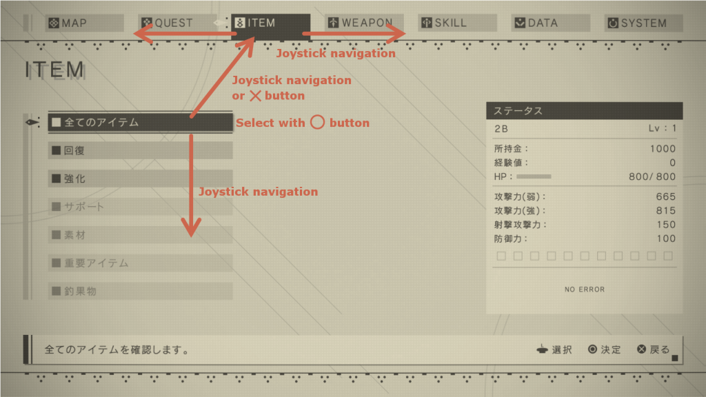
System menu. Source: Kijima's article linked above. © SQUARE ENIX CO., LTD. All rights reserved.
Colour austerity and visual simplicity
Warm beige surfaces and dark text establish a narrow tonal range. Hierarchy relies on alignment, rules, typography, and selected-area contrast rather than a different colour for every function. Fine graphic details give the flat composition character without overwhelming its content.
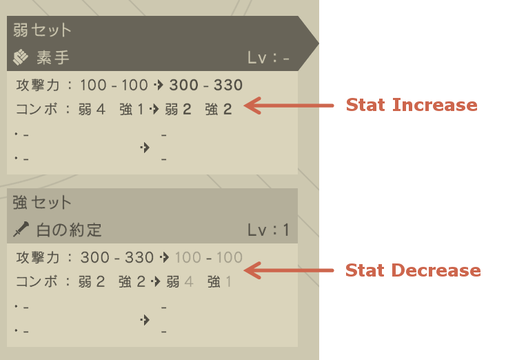
Status display. Source: Kijima's article linked above. © SQUARE ENIX CO., LTD. All rights reserved.
Simple navigation
The menus contain substantial information while keeping navigation economical. Kijima describes a basic interaction vocabulary of directional movement, confirmation, and return. The useful principle is predictable operation: complexity in the underlying system need not produce complexity in its controls.
Interpretation for Core UI
The following directions translate the menu analysis into a proposed White Eclipse visual language.
A coherent instrument
Treat each interface as a coherent working environment. Navigation, controls, lists, and information panels share a recognizable visual vocabulary and predictable behaviour. Carry over the sense of operating a carefully assembled system, while using labels and structures suited to the website's actual purpose.
A restrained, warm palette
Use warm off-white and pale stone surfaces with charcoal text as the foundation. Establish hierarchy through tonal contrast, spacing, and typographic emphasis. Reserve additional colours for information that benefits from distinction, such as feedback or project identity. Colour supports meaning alongside text, symbols, and visible state changes.
Flat structure and precise details
Build hierarchy with alignment, clear spacing, fine dividing rules, and simple rectangular controls. Selected items and prominent actions can use a contrasting solid fill. Keep surfaces flat, with little reliance on shadows or simulated depth. Small geometric markers and restrained line details can provide identity where they clarify grouping, selection, or navigation.
Readable typography and economical controls
Use typography to distinguish headings, readable content, and secondary annotations. Keep compact or widely spaced labels to short interface elements, with comfortable text for descriptions and long reading. Present controls with clear labels, consistent states, and a small, predictable set of actions. Group related information and reveal detail as needed so that a rich component suite remains easy to understand.
Smooth, restrained motion
Draw inspiration from the fluid way NieR: Automata's menus open, close, and move between views. Transitions should connect interface states naturally, supporting continuity and making changes in focus or selection easy to follow. Keep motion responsive and understated so that it complements the flat visual language and lets people act without waiting for an animation to finish.
The background study applies this direction through a fine woven surface, stationary arcs, and aligned diagonal strokes in White Eclipse colours. The corner-frame studies apply precision to controls while preserving readable state and focus cues. These are original CSS/component interpretations; no game background or border asset is copied.
Boundaries
The android operating-system reading supplies a sense of coherence and purpose; individual websites retain their own content and journeys. Core UI does not require fictional diagnostics, game terminology, or a simulated android desktop.
The reference's palette and flat menu structure inform the direction without fixing exact values. Readability, visible focus, and understandable feedback take priority over matching a screenshot's contrast or density. Navigation will suit the supported website inputs rather than reproduce the game's controller scheme.
Screen curvature, lens distortion, damage effects, and the game's 3D views are outside this menu-derived foundation. The logo's fragmentation effect is an example of the brand's connection to NieR and is outside Core UI's scope. Game screenshots remain external reference material. White Eclipse's components, icons, and decorative assets will be original interpretations.
Revisions
| Revision | Date | Author | Description |
|---|---|---|---|
| 1 | 2026-10-17 | Akane SHIMOKA | Initial draft |